Letter-fitting
Letter-fitting is the task of determining how glyphs should be positioned relative to each other. Let’s remember: a glyph is the visual representation of a letter, a character or a symbol. Letter-fitting work is good when the determined relative positions between glyphs allow for an efficient recognition of the glyphs themselves and an easy reading.
A measure to make it easier glyphs recognition, legibility, is a clear separation of shapes to avoid confusion. According to a non-collision criterion that could be called proximity. As the evaluation and control of how near two glyphs could come while still being perceived as two different entities. And also how far they could come while still being perceived as being part of the same word.

It’s also important to read text in a smooth, seamless, quick and easy way. A measure to facilitate reading, readability, would be rhythm. Why? A regular sequence of reference points marks the eye linear movement along the reading direction. The movement in space gets timed by visual beats. The rhythm creates order and, therefore, predictability in the spatial location. Obviously, this movement is an abstraction that has nothing to do with what happens at a physiological level. It’s more the conceptualisation of the mental process of recognising a regularity in the disposition of glyphs. In this specific case: regularity in advancing.
The white spaces, connecting the glyphs, while being bounded and formed by them, rule the disposition of the glyphs themselves. They are the adjustable components that can enable a horizontal regularity in a sequence of heterogeneous elements by the mean of their consistency. As shock absorbers between the wagons of a train that make the same journey with different accelerations. As a visual quality, rhythm may mostly mean: perceived homogeneity of the white spaces.
What rhythm, homogeneity and regularity are essential for, is the process of grouping glyphs into a superior element of detection: the word. Which is necessary for reading.
Grouping is a topic in cognitive and perceptual psychology. Qualitative ideas have been proposed in Gestalt psychology. Especially several principles of grouping:
The principle of adjacency states that we perceive objects close to each other as forming a group.
The principle of similarity states that elements within an assortment of objects are perceptually grouped if they are similar to each other.
The principle of continuity states that objects’ elements tend to be grouped, and therefore integrated into perceptual wholes if they are aligned within an object.
The principle of good gestalt states that elements of objects tend to be perceptually grouped if they form a pattern that is regular, simple, and orderly.
[https://en.wikipedia.org/wiki/Gestalt_psychology]:
Glyphs in words are adjacent. They’re mostly aligned along lines parallel to the reading direction: the baseline, the x-height line, the cap-Height line, … depending on the script. Serifs amplify the effect of continuity. Glyphs in a typeface are designed to be consistent in terms of style, design, dimension, mass, … Similar from a Gestalt point of view. These are design prerequisites for the grouping phenomenon to happen efficiently.
The disposition of glyphs has to be regular, and ordered too. And so the white spaces have to be similar. That’s where the concept of rhythm comes in: similarity tends to coincide with equilibrium: the central glyph in a triplet has to appear equidistant from the neighbours; as an instance of symmetry. The human eye senses symmetry unconsciously. Let’s have a look at a kaleidoscope, a face or a butterfly, for example: there’s no need to measure or count the parts to be aware of it.
The same applies to the white spaces. Equilibrium is the appearance of symmetry, or better: the awareness of the symmetry of something non-geometrical. It’s also consistency: the repetition of congruent patterns in similar combinations creates a sort of similarity in retrospect. It’s also tolerance as long as the perception has wider margins than geometric measurements.
Alphabets often inherently favour equilibrium, anyway, as they contain many symmetric glyphs and many glyphs that share the same boundary outlines. Nowadays, equilibrium is an attribute that needs to be actively achieved in all the possible combinations of glyphs. Especially disfavoured asymmetric ones.
It’s a need because imbalances, losses of equilibrium, are detected as disturbing visual noise as they raise the level of consciousness in an act, that of reading, which should remain unconscious. Even when they do not impact the elaboration of the semantic content. Because they introduce elements of ambiguity: is the word broken? Are those graphic elements belonging to one or two glyphs? It’s not a matter of comfort but more a matter of efficiency. Equilibrium is essential to guarantee readability.
The reference points that set the rhythm are the transitions between light and dark. They can be of any shape, but the most effective and noticeable is the sharp one determined by a vertical line; vertical as perpendicular to the reading direction. Not only for the basicity of the pattern but also because perceived symmetry equals geometric symmetry in this case. It’s typical of the stem element, as defined in typographical anatomy. A regular progression of stems is said to be fundamental in the formation of rhythm.
Rhythm is a quality of a set of glyphs as a whole while proximity can only be related to two near glyphs. So legibility and readability are independent properties. And so not necessarily fulfillable at the same time.
The easier way to maximise legibility would seem straightforward: set the glyphs far from each other. This solution may rarely be acceptable from a typographical and economic point of view, anyway. The same amount of space, occupied by fewer words, would carry less meaning. It would be a waste of medium.
What’s more, over a certain limit of separation, reading would become more difficult because of the ambiguity in detecting a single word vs a group of separate letters. To keep on with the previous rhythm metaphor: it would be like running at too slow a pace.
Above a certain limit, legibility undermines readability.
The boundary outlines, the outer portions of the glyphs that shape the surrounding white spaces, can be straight or curved, vertical (perpendicular to the reading direction) or inclined, convex or concave, open (including portions of the white space in their structure) or closed, simple or complex, ...
Of course, there are many different glyph shapes, and not all their combinations could simultaneously ensure absolute perfect legibility and readability, when the typographic space gets more crowded.
To maximise readability, equalising white spaces, some glyphs may tend to approach, touch or even overlap. Undermining legibility.
To maximise legibility, equalising minimum distances, some glyphs may tend to move respect to their neighbours. In some cases away, to prevent collisions, in others closer, to perform interpenetration. And so tending to make the white spaces heterogenous. Undermining readability.
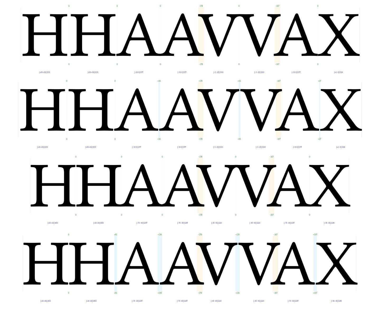
So the level of tightness, the planned density of glyphs and, conversely, the planned amount of white space around the glyphs, sometimes called air, rules the interference between readability and legibility.
The tighter the setting, the more interaction gets triggered among glyphs. Requiring to accept a combined reduction in legibility and readability, properties that become more and more self-excluding.
It would seem that there may be a sort of comfort zone, not too loose and not too tight, where geometrical freedom makes it easier to find an optimal relative positioning of the glyphs while trying to keep all of them well separated and homogeneously paced.
Unfortunately, the level of tightness is rarely a choice since predetermined by the design and the expected use the typeface has been created for.
In typeface design, the first design element that influences tightness is the Weight, the relative thickness of the strokes. A heavier design implies smaller counters, the white spaces inside the glyphs themselves. For a matter of balancing internal and external, the space around the glyphs has to tend to reduce proportionally.

The expected use of a typeface gets reflected by the size, instead. Typical codified uses are:
Caption: below 8 points
Small Text: 8-11 points
Body Text: 11-14 points
Subhead: 14-24 points
Display: 24-60 points
Poster: above 60 points
Text stands for running text, referred to a typeface conceived for reading long paragraphs. Instead, Display refers to a character for short sentences, such as newspapers’ headlines, if not individual words like logos.
With the same viewing angle, the smaller the size, the more the glyphs we can detect at once. And the more the glyphs we look at, at the same time, the fewer details we can get. Both for the eye’s limited resolution power, both because our visual system tends to prioritise the most critical features: the ones necessary to process a text’s meaning. The same reason why we can listen to an orchestra without separately detecting all the concurring instruments.
The smaller the size, the more relative space around glyphs is required. As a help in detecting smaller objects, the glyphs, as separated. Which is the definition itself of legibility.
The increased difficulty in catching details affects the outer and inner parts of the glyphs: the counters get less noticeable, so glyphs become inherently darker. So that a looser setting also compensates the colour, the perceived level of grey.
In size-specific type design, the subtlety of details in the drawing of the glyphs gets modulated, taking into account what can be effectively appreciated by the eye at a certain planned size. It amplifies the above-described phenomena. Design for small sizes tends to become less detailed, less contrasted and, for compensation, wider; and darker.

Conversely, the bigger the size, the less air around glyphs is required. Because the inter-distance between glyphs, that is a detail to be caught, can relatively get smaller.
Design for big sizes tends to become more detailed, contrasted, nuanced and, for compensation, narrower and more open. All of this favours tightness and interpenetration in setting, determining an economy of space that gets desirable from a typographical perspective. For example: for a headline in a newspaper.
The smaller the size, the more the white space tends to be seen as a whole, so that its predominant feature becomes its extension. White spaces embedded in words have to be homogeneous. And this is congruent with the relation between rhythm and readability envisaged at the beginning of this chapter. Ideal sizes for reading are on the smaller side of the range.
The bigger the size, the less the glyphs we can detect at once. The boundaries of the white spaces get more observable, so that their predominant features become the minimum distance(s) between the glyphs. The grouping phenomenon gets weaker as the area of attention is not the full extension of the white spaces but portions around points of close contact. And more easily the eye can dwell on details. In this case, the act of looking at glyph also becomes an act of observing.
The tightness related to bigger sizes makes equilibrium harder to achieve. But at the same time, rhythm tends to become less relevant because out of scale. Eventually, it becomes equally or more important how glyphs stay close to each other. The arrangement: how they approach and how they interpenetrate. The texture. As a form of regularity in interconnection.
So rhythm and texture are both qualities of regularity in the disposition of glyphs: in advancing for rhythm, in interconnection for texture. They both imply patterns, but of a different, and somewhat opposite, kind.
We started defining letter-fitting in terms of readability and legibility. We ended up with the same concepts. Meanwhile, we encountered related concepts like tightness, rhythm, proximity, interpenetration, equilibrium, texture.
They form the vocabulary of letter-fitting:
- rhythm and texture have to be designed.
- tightness, interpenetration and proximity are the tools.
- equilibrium has to be achieved.